back Next project: Full Service for Sodexo Previews project: TENDER FOR A CLIENT

peppermint

CATEGORIES: ATL , BTL , DIGITAL

Rebranding of Zortrax

Client:
Zortrax

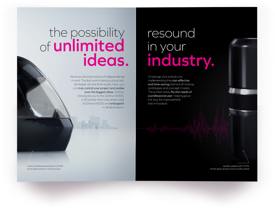
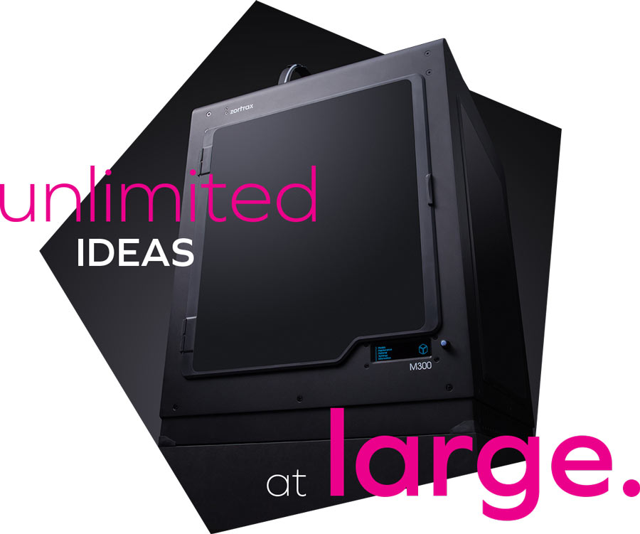
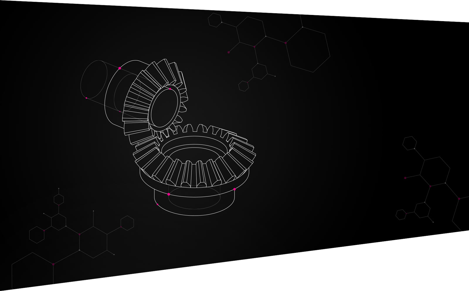
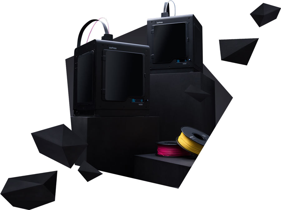
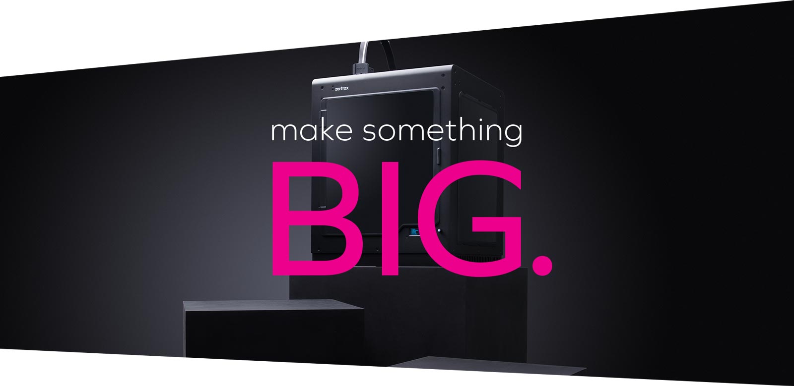
In 2016, we carried out the rebranding of Zortrax, changing both the brand’s graphic design and the manner of communication with the clients. In general, those activities allowed us to distinguish the brand from its competitors and to highlight the image of a leader. Zortrax rebranding was the first such a bold presentation of a product from the segment of spatial printing technology, bringing the brand closer to the style used by products of the highest-class design.

We were responsible for:
Creation , Creative concept , Strategy , Tonality
https://peppermint.pl/en/wp-content/uploads/sites/2/2018/09/rebranding-gallery-1-1.png

Visually, the new Zortrax communication is dominated by black colour, which refers to the professionalism and sophistication typical for designer products. As a necessary addition, the icing on the cake, magenta has been used – deep purplish red representing intransigence, competitiveness but also courage since it is rarely linked with technology.

https://peppermint.pl/en/wp-content/uploads/sites/2/2018/09/rebranding-gallery-2-1.jpg

The determined nature of the brand and the fact that it brings uncompromising challenges can be seen mainly in the headlines. Due to their size and arrangement they have become a determinant of the tone of graphics, complemented with equally bold copy, referring to pop-cultural phrases. The new communication has underlined Zortrax’s courage and confidence.

https://peppermint.pl/en/wp-content/uploads/sites/2/2018/09/rebranding-gallery-3-1.jpg

Also, the new communication has given us a large room for narration about the device itself – an inconspicuous black cube that can create objects of various shapes. This is what the solid shapes and polygons reflect, referring to the three-dimensionality of objects, but also enriching images and stimulating the imagination.